17
May 21
What have I been working on over the last few months?
New client work and website update
Well, it was about the middle of last year when the pandemic was in full force that I decided I needed a new strategy to encourage more client enquiries which led me to review my website and the content that was on there. It looked a little tired and the work had become increasingly out of date so I needed to reinvent myself and get my voice heard.
The first few areas I identified that needed attention was?
1. New case studies and page structure
My work had previously been presented in a horizontal scroll format on desktop with a selection of screenshots. This may have looked interesting and creative at the time but to potential clients it didn’t have enough meaning, there was no understanding of ‘the problem’, what ‘process’ I went through and what ‘conclusion’ was made. There was no narrative and it was lacking in context, plus there needed to be a lot more copy on the page to explain the detail. I had to get this right so off to work I went, if you’ve not already have a quick look at what I created.
2. Blog articles and content
Once I got my case study pages underway I really needed to sort a blog out. One thing that was missing in my portfolio was personality and I had to make my voice known so users or potential clients could read a bit of background and view everything about me all in once place, plus Google loves new content so that was next on the ‘to do’ list.
3. A shiny new home page
It goes without saying that your home page is probably one of the most (if not the most) important pages of your site. I wanted to create the pages around it in the first instance as the home page is the hub of sign posting. I needed a strong introduction with more visuals of me on there, as my previous site was faceless – if you want to attract more clients then they would really like to know who there going to be working with at a glance.
Other considerations
It’s not just about the work you’ve done but also about how you did it, so the ‘process’ needed to be clear and obvious too. Also I had to make my service offering easy to view as well. I didn’t make a dedicated page for this but I clearly defined the services I offer on my home page, this would help potential clients understand whether you’d a good fit for what they might be looking for.
When I was designing the home page I thought ‘if I want to add more personality then why not introduce myself in a short video?’ Why not let people see me and I’ll explain what I do in my own words making them feel like we’ve connected in person before making an enquiry. I’ve had good feedback from clients about this so I’m glad I put it together.
Working with new clients
I made updates to my site in the order I mention above and gradually started to see new client enquiries arrive in my inbox.
‘Hi Richard, Awesome work! We have a project that seems like it’s right up your alley. What’s your schedule like for a quick zoom?’
Rochelle Rietow – Helloinnovation
The enquiries started to build and I found that some really interesting pieces of work started to come through which was the goal I was aiming for. As a freelance UX designer I wanted more variety and new challenges which is exactly what I have at the minute, even to the point where I have to be selective around how busy I want my schedule to be and politely let clients know that I’m currently unavailable.
Sneak peek at some current work
Over the last 6 months I’ve had around 4-5 projects on simultaneously which I’ve carefully planned into my schedule so not to over promise work that I can’t deliver. One of the big changes I made in my workflow was moving from Sketch (which I loved) to Figma (which I’m now in love with). Here is a sneak peek at some work in progress.
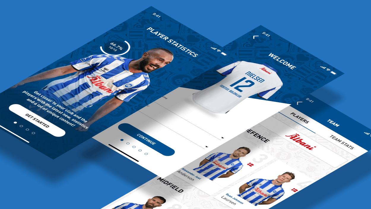
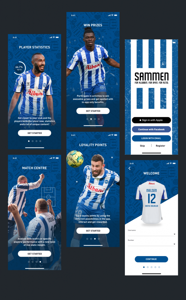
OB – Danish football club an app.
I was approached by an agency called ‘Many Digital’ to create a white labelled football fan app which promotes club features of which they wanted resell to different clubs. Here’s one for https://www.ob.dk/
Onboarding
These key screens introduce the main features of the app, player statistics, win prizes, loyalty points, match centre and more. Also whilst signing up the user could customise their experience by adding their surname and number displayed on the team’s shirt.
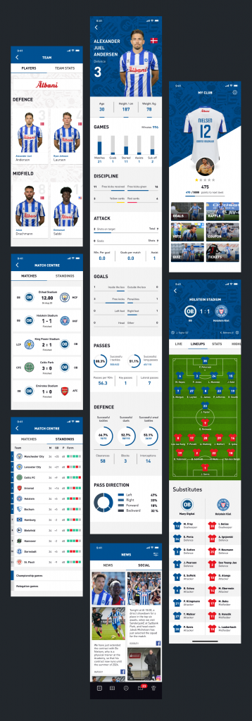
In app pages
A selection of featured screens that showcase the Team, Profile (My Club), Match Centre, News and Social. I’ll be putting together a full case study outlining some of the challenges I encountered whilst designing the app, but I wanted to show this off in the meantime.
That’s all for now folks
Hope you enjoyed the update, I have quite a few other pieces of work on right now (apps, websites and SaaS products) but always happy to chat about new and exciting opportunities. Feel free to get in touch below and let me know if we can work together. Also I do give out free advice based on my own experiences, so if you want to chat about how to get into being a freelance UX designer, or guidance on UI design and design systems, let me know. Chow for now ?

0 Comments
Nobody has left a comment yet, be the first and leave your thoughts.