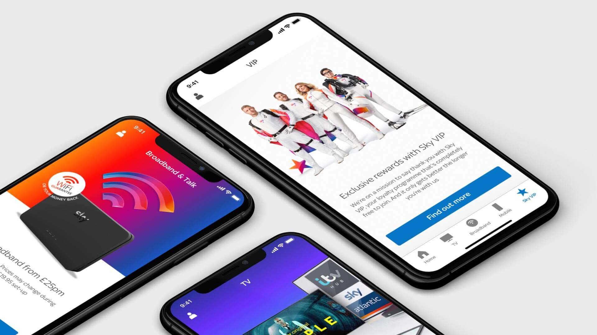
My Sky app
Discovering content you love
My Sky app is a utility app to track bills, manage and upgrade products, roll unused mobile data with an opportunity to join the Sky VIP loyalty programme.
The problem
The app presents itself with basic information to just check your bill, roll mobile data and view offers resulting in customers not engaging regularly with content in the app. The experience is not tailored and the depth of Sky content is not being utilised to the user.
The challenge
How do we bring the app to life to enable it to be the home of content? How might we define an experience that allows the user to discover tailored material to ensure the app is engaging for habitual usage? How do we educate what content is available inside their current package with options to upgrade?
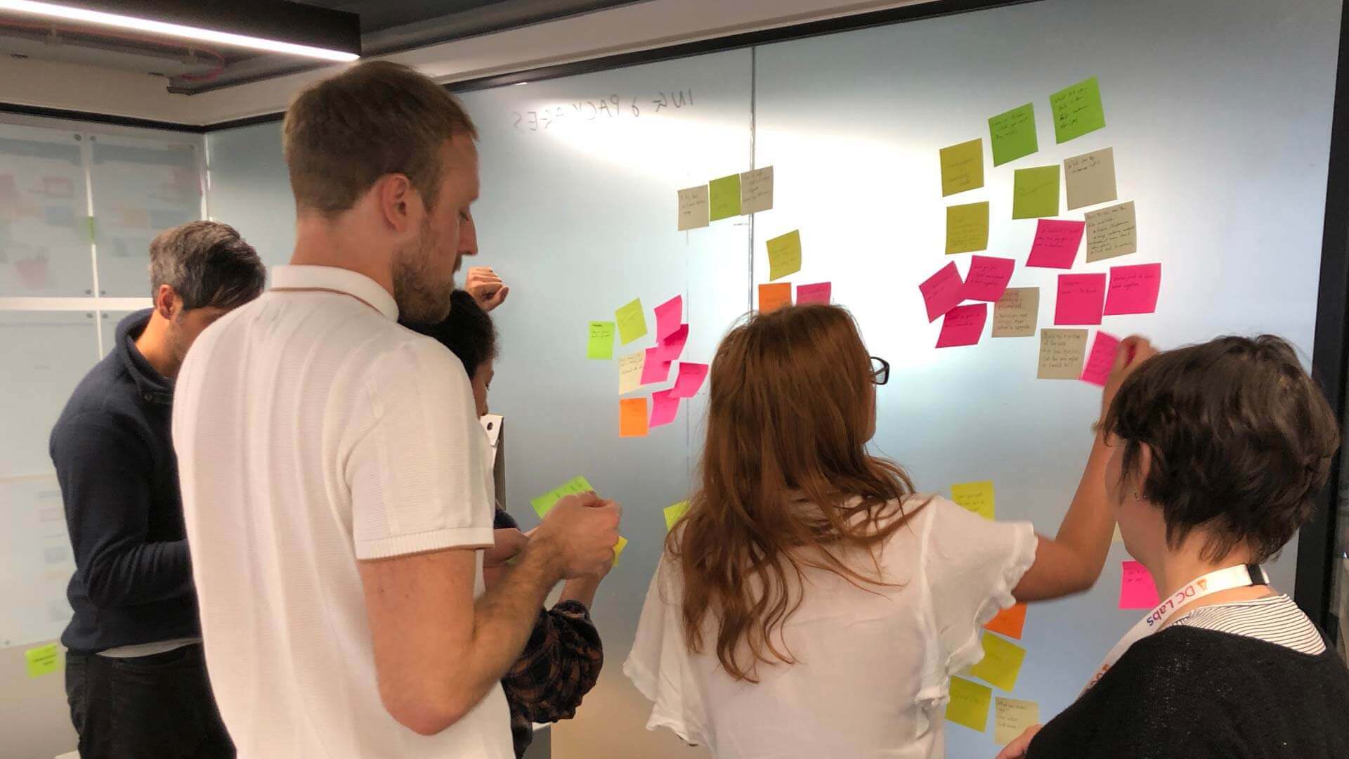
Ideation
exercises
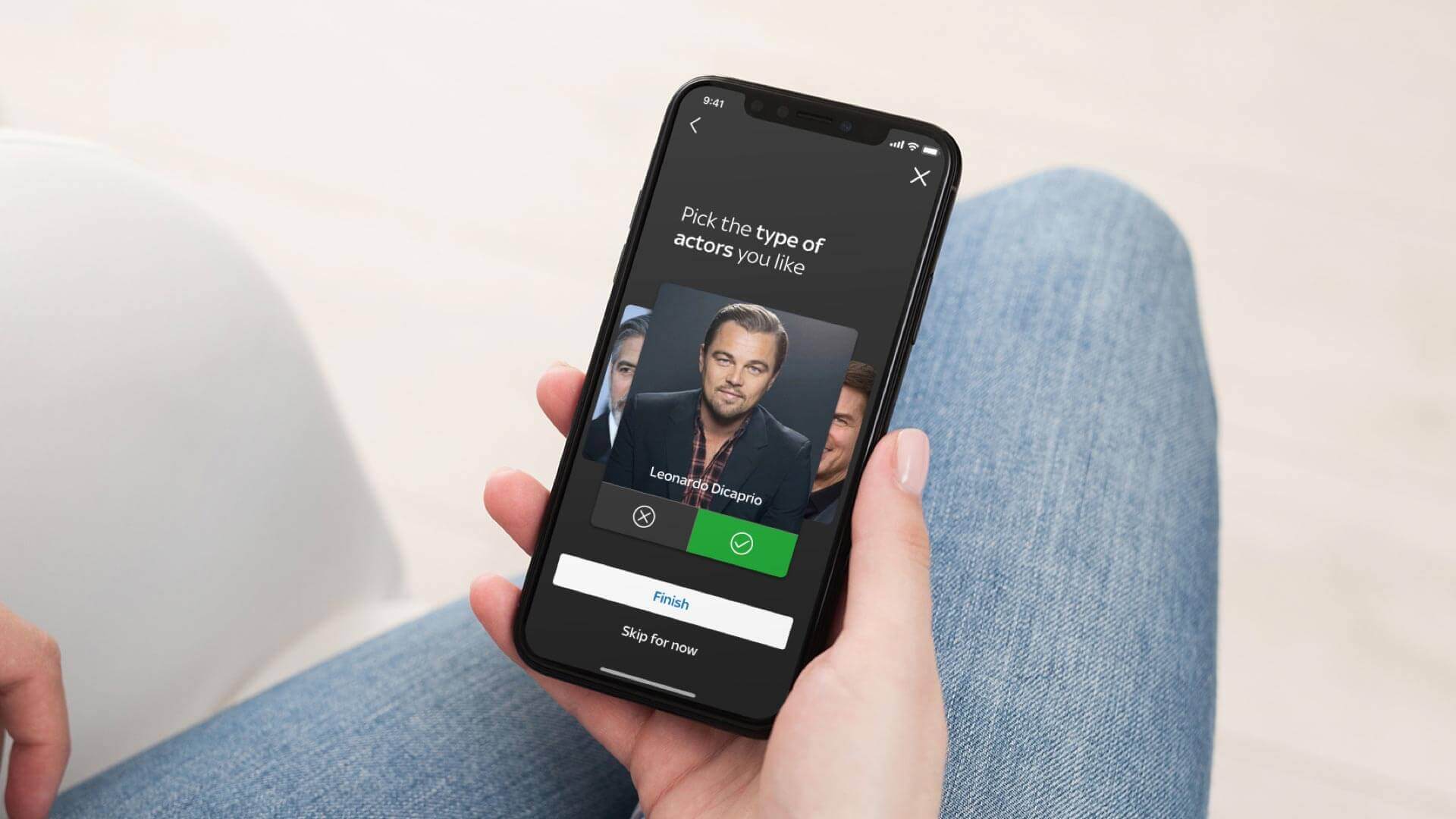
How do we personalise content for the user?
Capture customer’s habits around the whole of the sky estate (apps, sky box, website). Explore a “Tinder style” survey to build a library of what they do and don’t like, recommend new and old shows based on this. Introduce an interactive engaging experience that pulls from the users’ mood, thoughts or feelings, done in a non frictional way.
Serve content based around watching habits
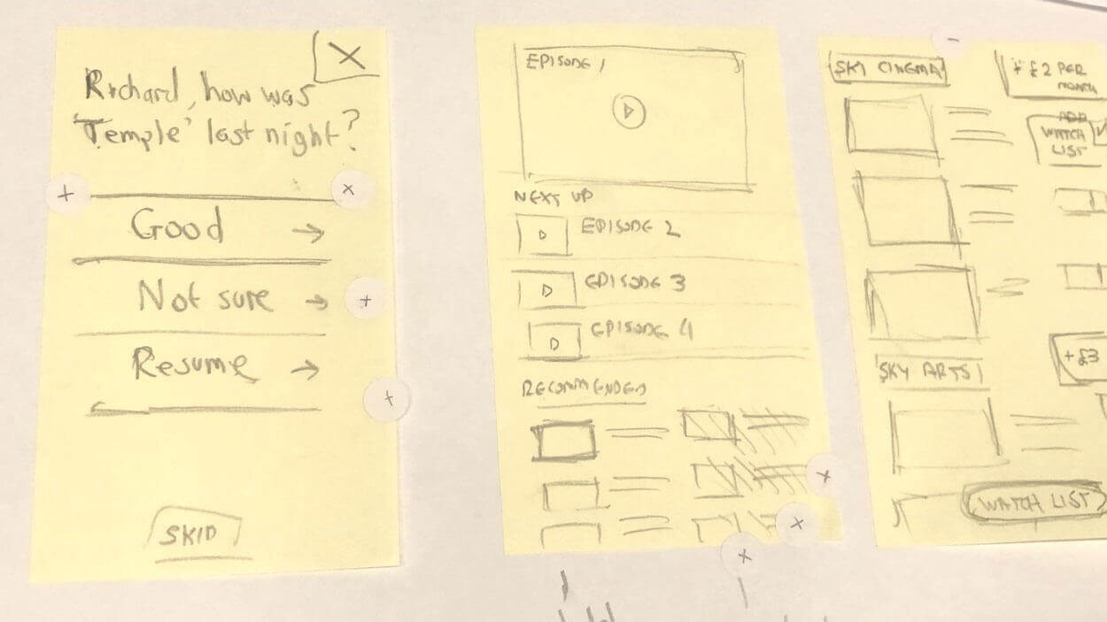
Build up a picture of behaviour
Let the user discover and organise
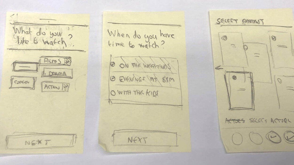
Guerilla
testing

Content based around watching habits
All participants (7) understood that the questions will be used to personalise the content that is shown or recommended. 1 participant felt there were too many questions and would dismiss after the 2nd one.
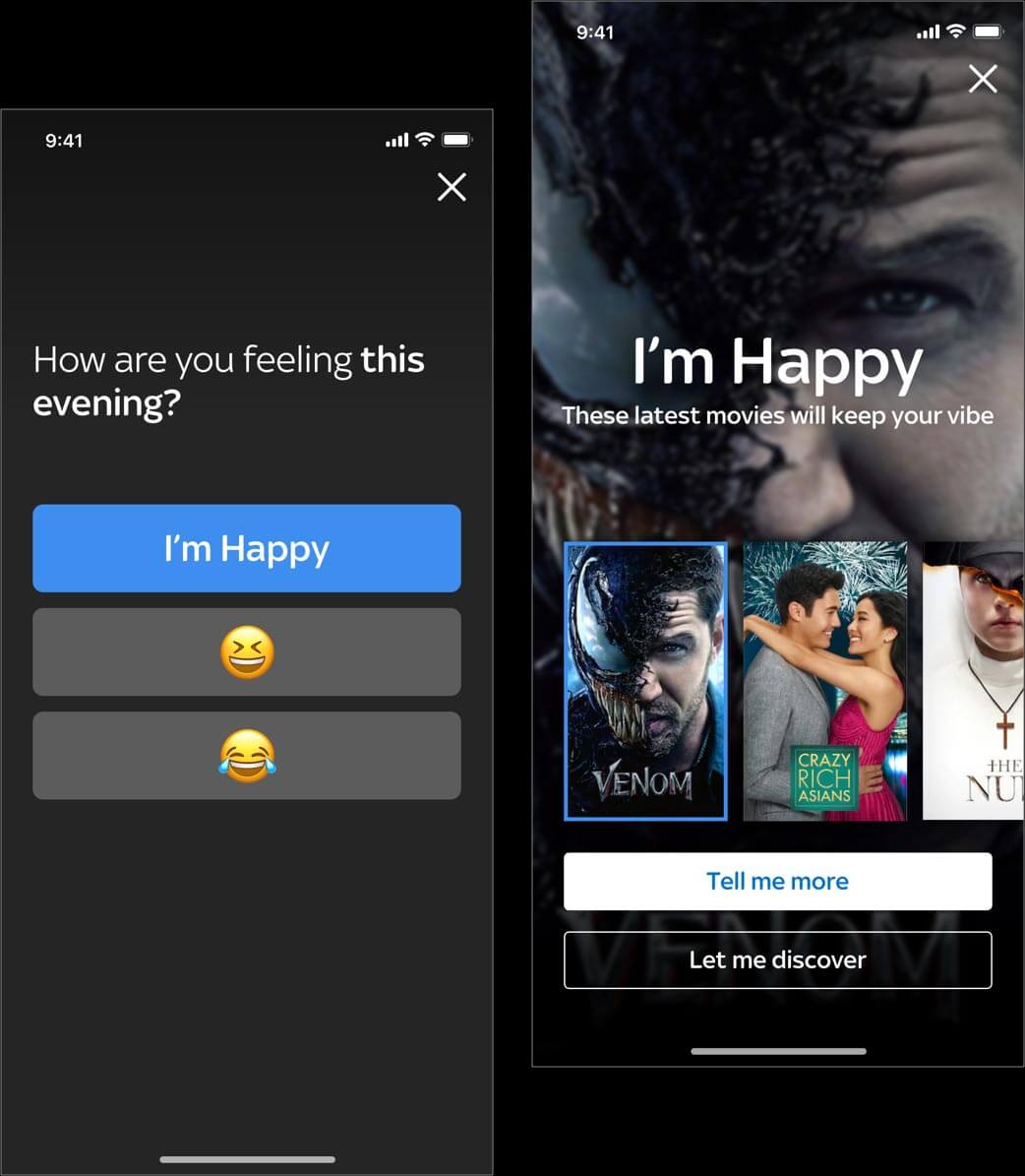
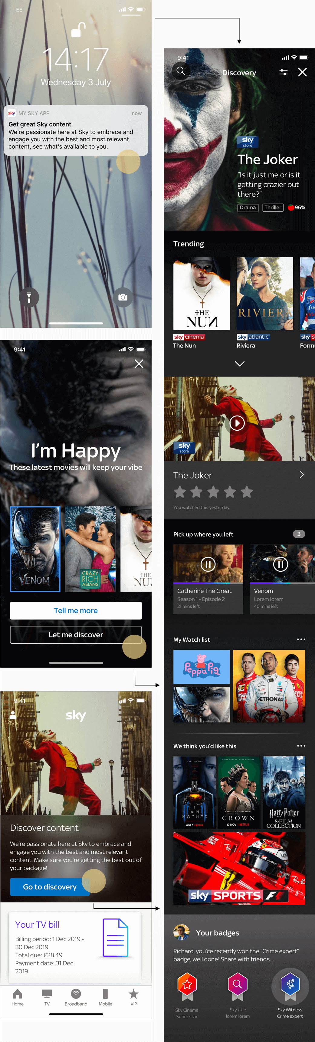
Recommending what to watch now – mood based
4 out of 7 participants were unclear about what emoticon to choose. Participants also mentioned that their mood doesn’t necessarily affect what they want to watch “Just because I am saying that I am happy doesn’t mean that I want to watch a comedy”. 1 participant was unclear of what CTA to choose on the final screen and didn’t understand the difference between the 2 actions ‘Tell me more’ and ‘Let me discover’
ideas for
iteration
1. Limit the number of questions asked relating all of them to content previously watch.
2. Have different notifications according to the journey that will be presented to the customer.
Some participants mentioned that from the notification text they would expect to see recommended content, not already viewed TV shows
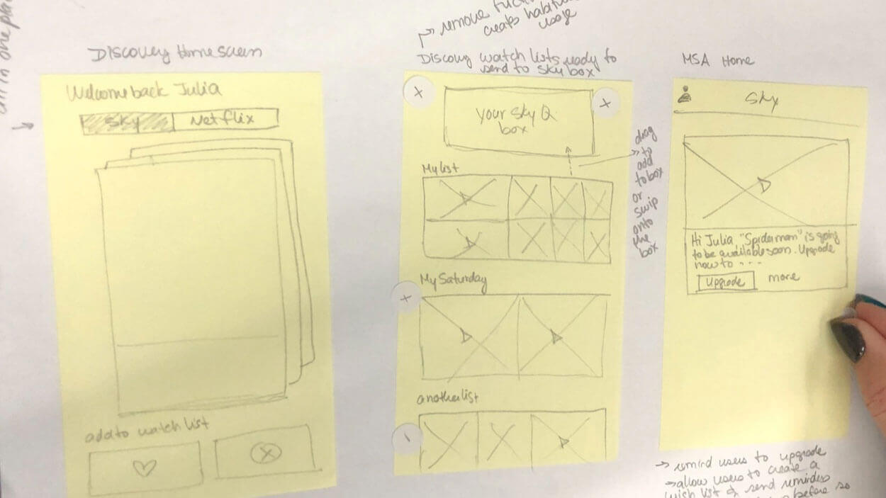
Entry
points
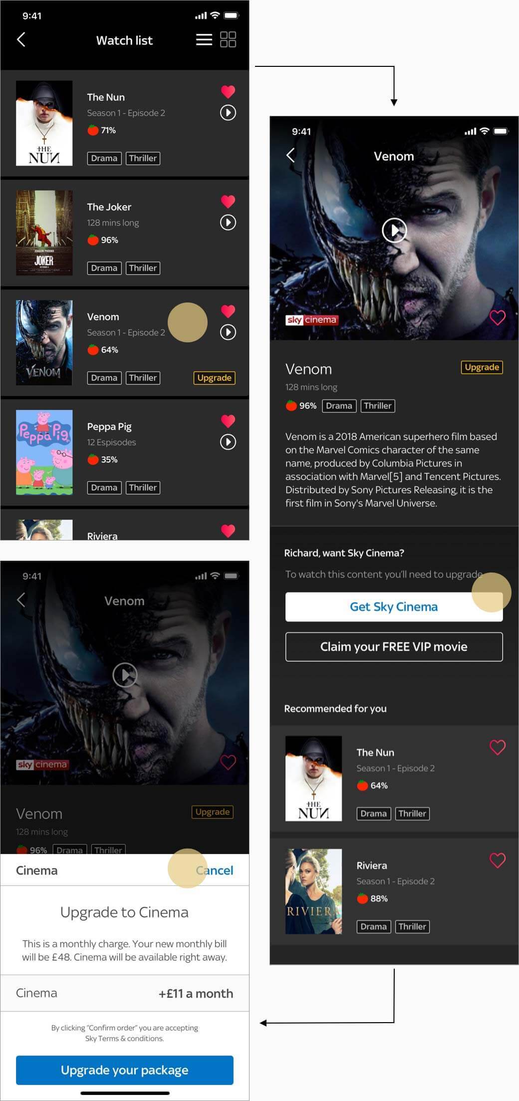
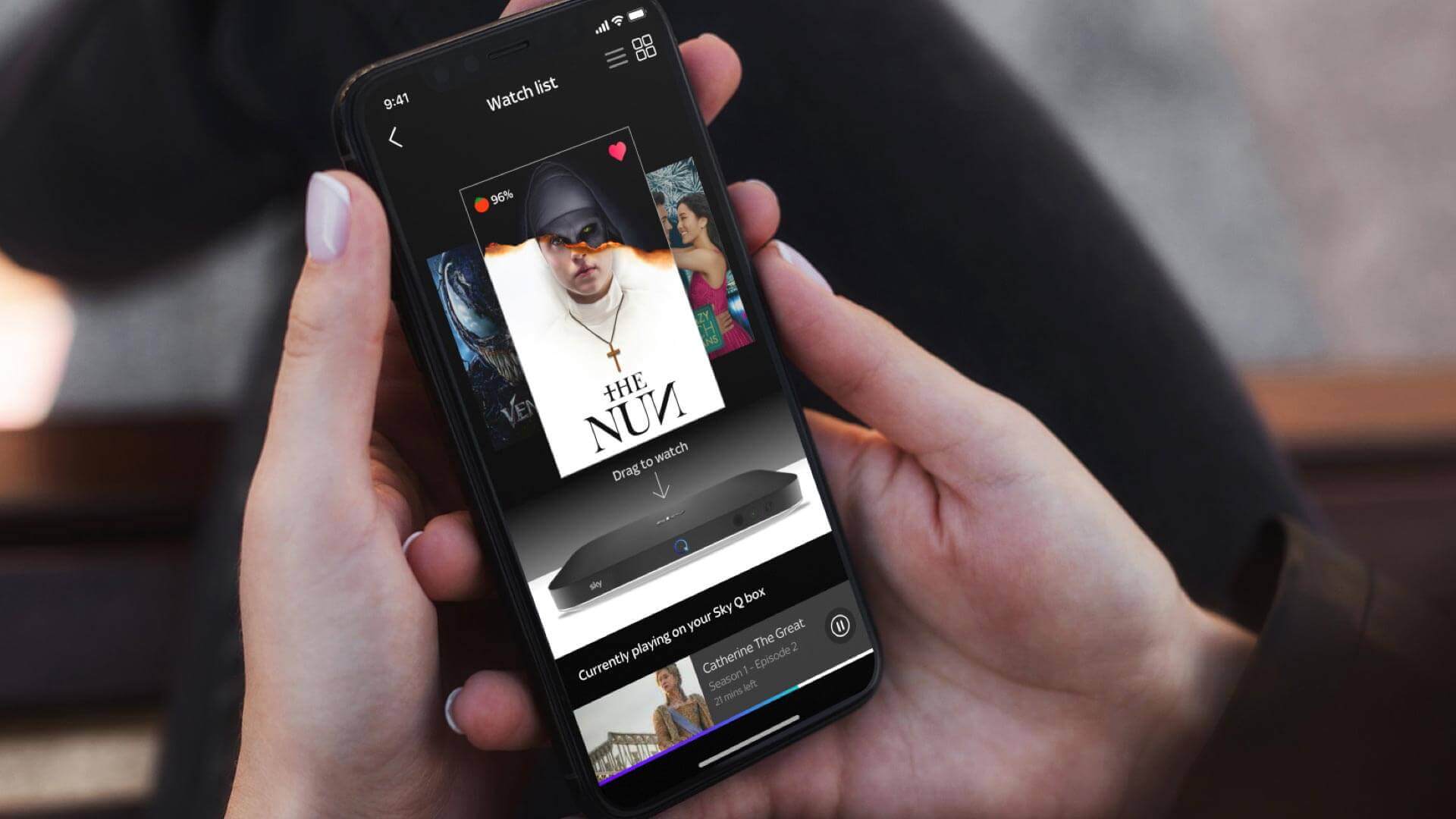
Accessing the ‘discovery area’ within the current app architecture
The app bar was product lead so we had to decide where the placement of the ‘Discovery area’ could be and how it might be accessed. Push notifications, home content area and behavioural questions lead to the discovery area to educate the user of new content
Voice
search
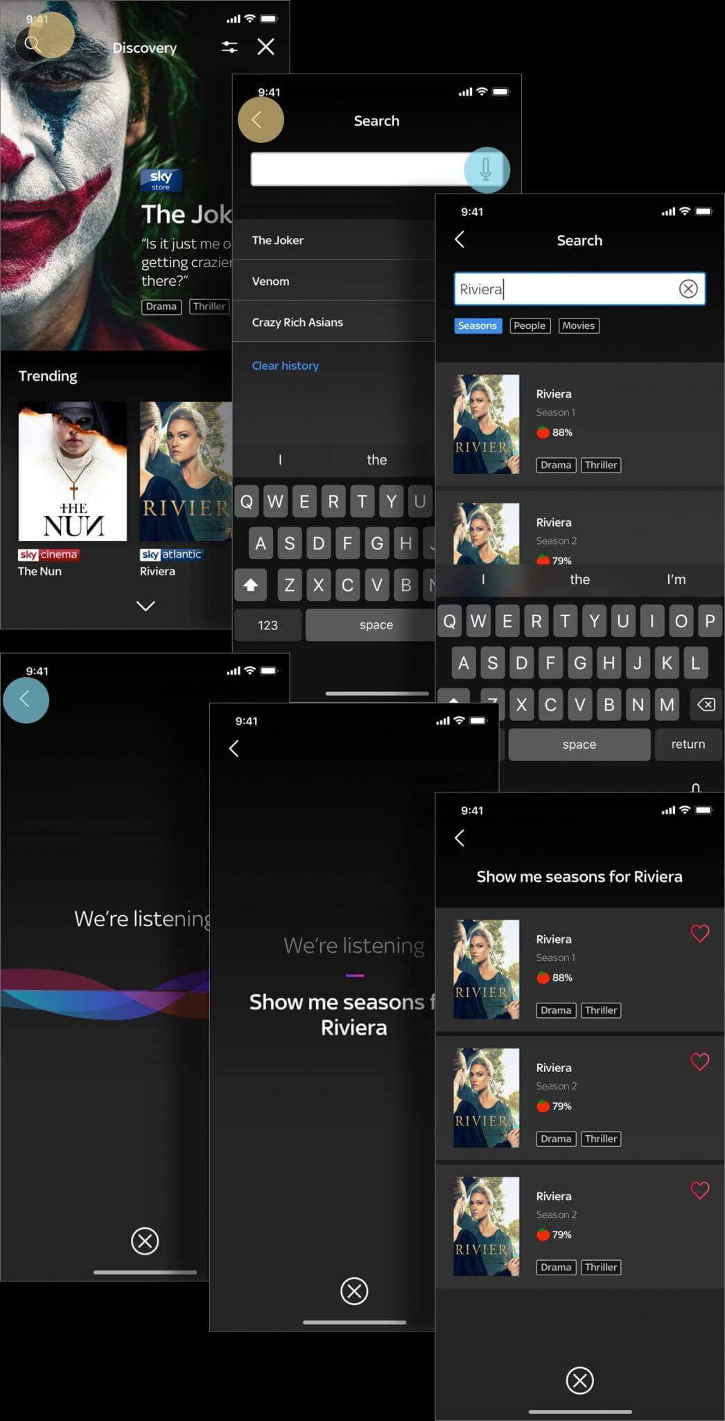
Machine
learning
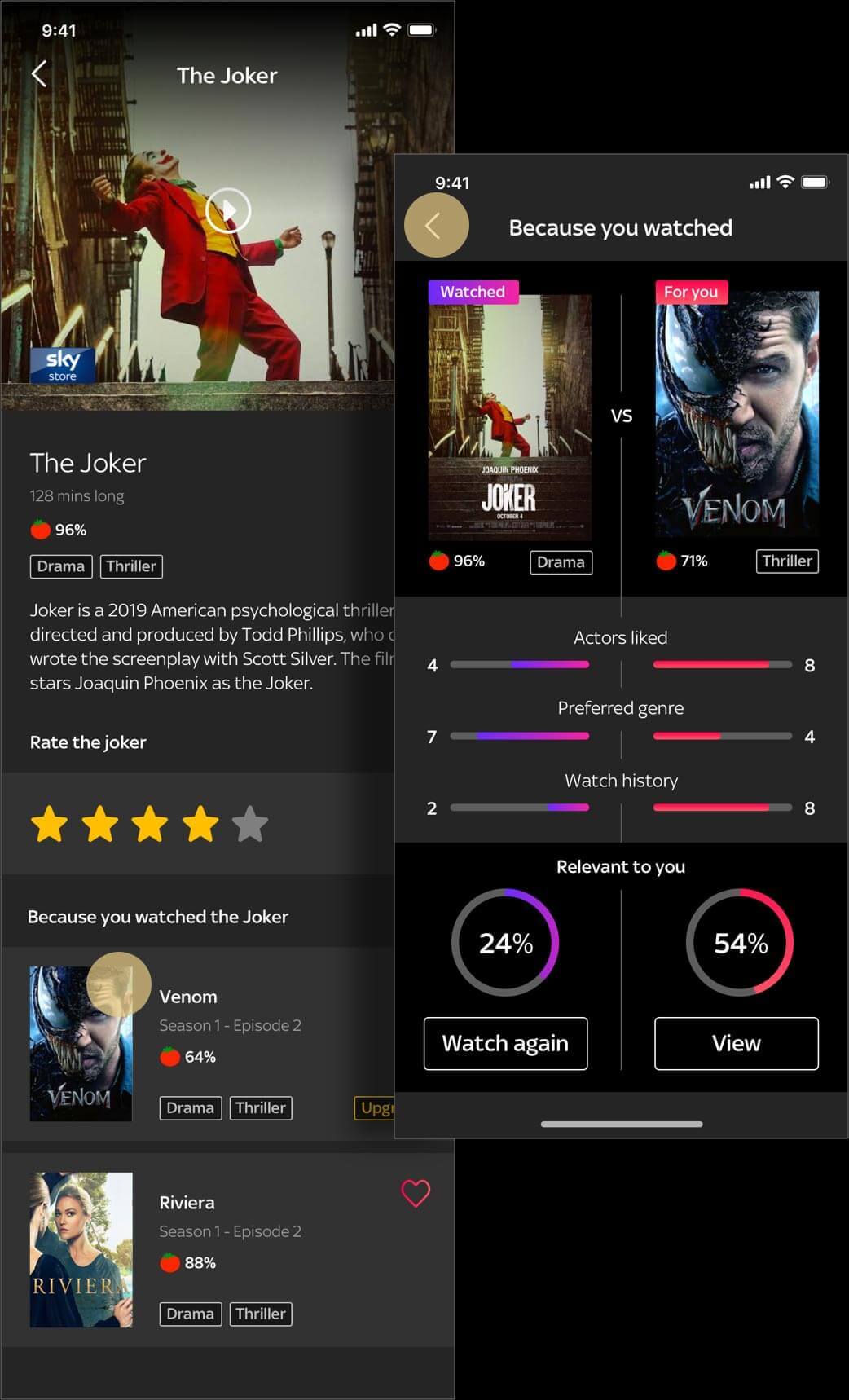
Learning from user behaviour
Once an initial profile of behaviour had been established the app proposed ideas of artificial intelligence (AI) that provides the ability to automatically learn and improve from the users’ experience without being explicitly engineered. Based around watching habits and natural interaction of star rating, settings and watch history – the app would learn, predict and automate the best possible match of content with no effort from the user.
Upsell
package
Discover content and upgrade
From a user perspective we wanted to showcase what content was available to them within their current package to discourage downgrades and from a business perspective we needed show what content that they could upgrade to without being too pushy. Rather than the whole experience feeling like a sales pitch it needed to be a natural process of exploration so the user could make their own decision if they upgraded or not.
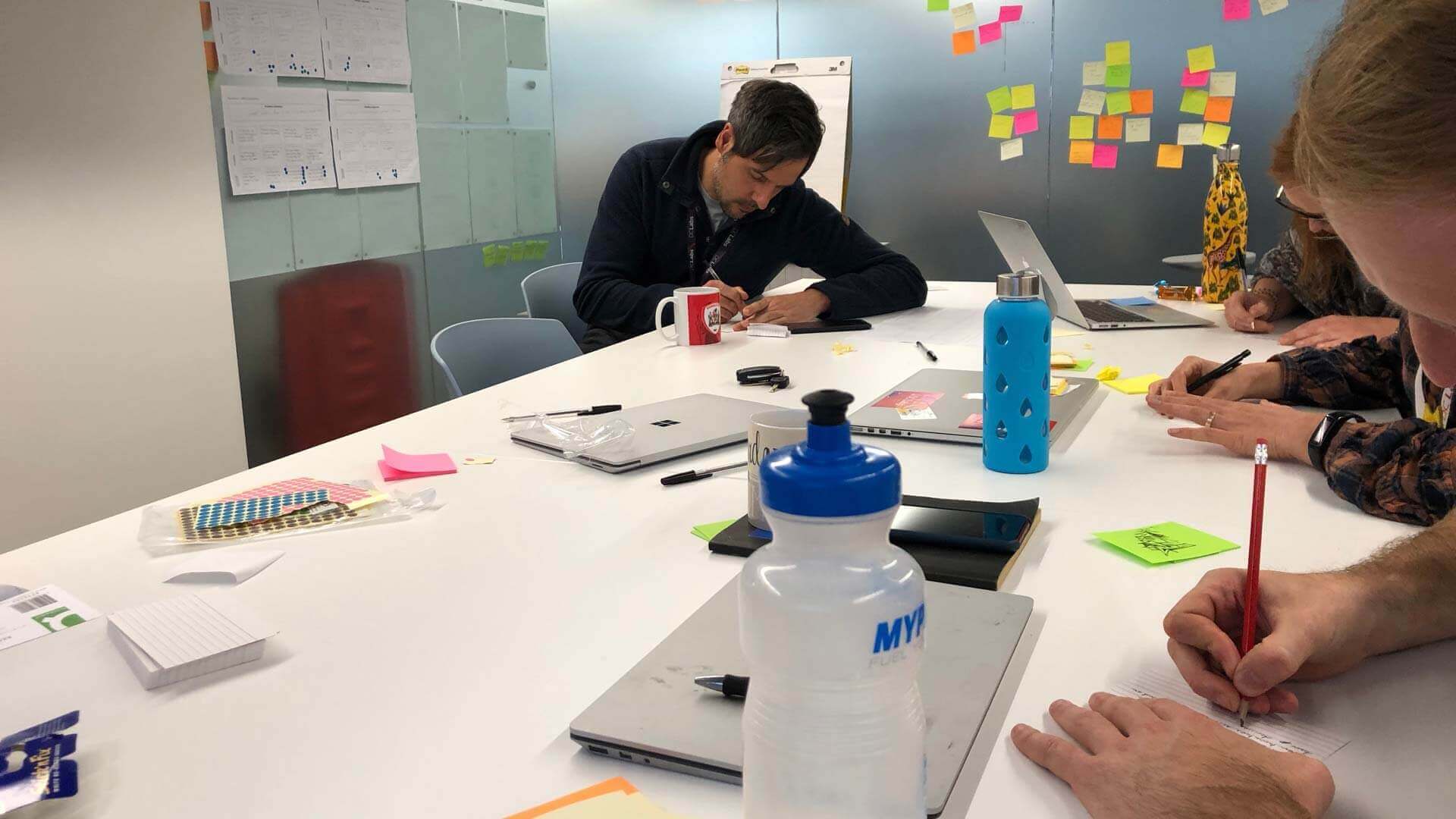
Team
effort
UX research with UI and prototyping
All team members contributed towards ideas of ‘How customers will interact with a content discovery area in My Sky app’. Workshops were setup up by a UX designer where thoughts were expressed by the team. My contribution within this project was UI focussed creating and mapping out flows from sketches and evolving a high fidelity prototype of which I participated in guerrilla testing for feedback to understand the psychology and science behind how users interpret the information presented within the designs. Once I finalised the end to end experience with input from UX research, it enabled the UX and UI design team to present back findings and validate our approach to the wider business.

Rich is a talented and experienced UI designer with a fun and charismatic character. I really enjoyed working and learning from him. He brought lots of experience to the team and quickly became involved in all projects.
I especially enjoyed our conversations about design, he was always happy to take feedback on board and did not hesitate to say what he thought about any projects, providing very constructive criticism. In general a great professional and a good colleague.